
Summary
- The W3C's first Media Queries Working Draft appeared on 4 April 2001. Earlier HTML and CSS could already choose broad media types such as screen and print; the draft let a stylesheet ask more precise questions about the environment.
- A Candidate Recommendation followed on 8 July 2002. The Recommendation of 19 June 2012 specified feature expressions such as viewport width, height and color, so an author could attach presentation rules to conditions while keeping one document.
The page looked magnificent in the editor's wide window. Its three columns had room to breathe; the navigation sat where the designer expected. Then somebody dragged the edge of the window inward. The right column leaned on the middle one, the headlines stopped speaking to one another and the navigation demanded an aisle seat. A printer arrived next, carrying a sheet of paper and the conviction that blue links were a waste of ink. The story had done nothing wrong. Its clothes were cut for one room.
Stylesheets already had a rudimentary wardrobe. As the W3C's first Media Queries Working Draft, published on 4 April 2001, explained, HTML4 and CSS2 could distinguish media types such as screen and print. That was useful when paper and a monitor needed different rules. It was much less useful when two screens had wildly different available widths. Calling both of them “screen” answered the wrong question with great confidence.
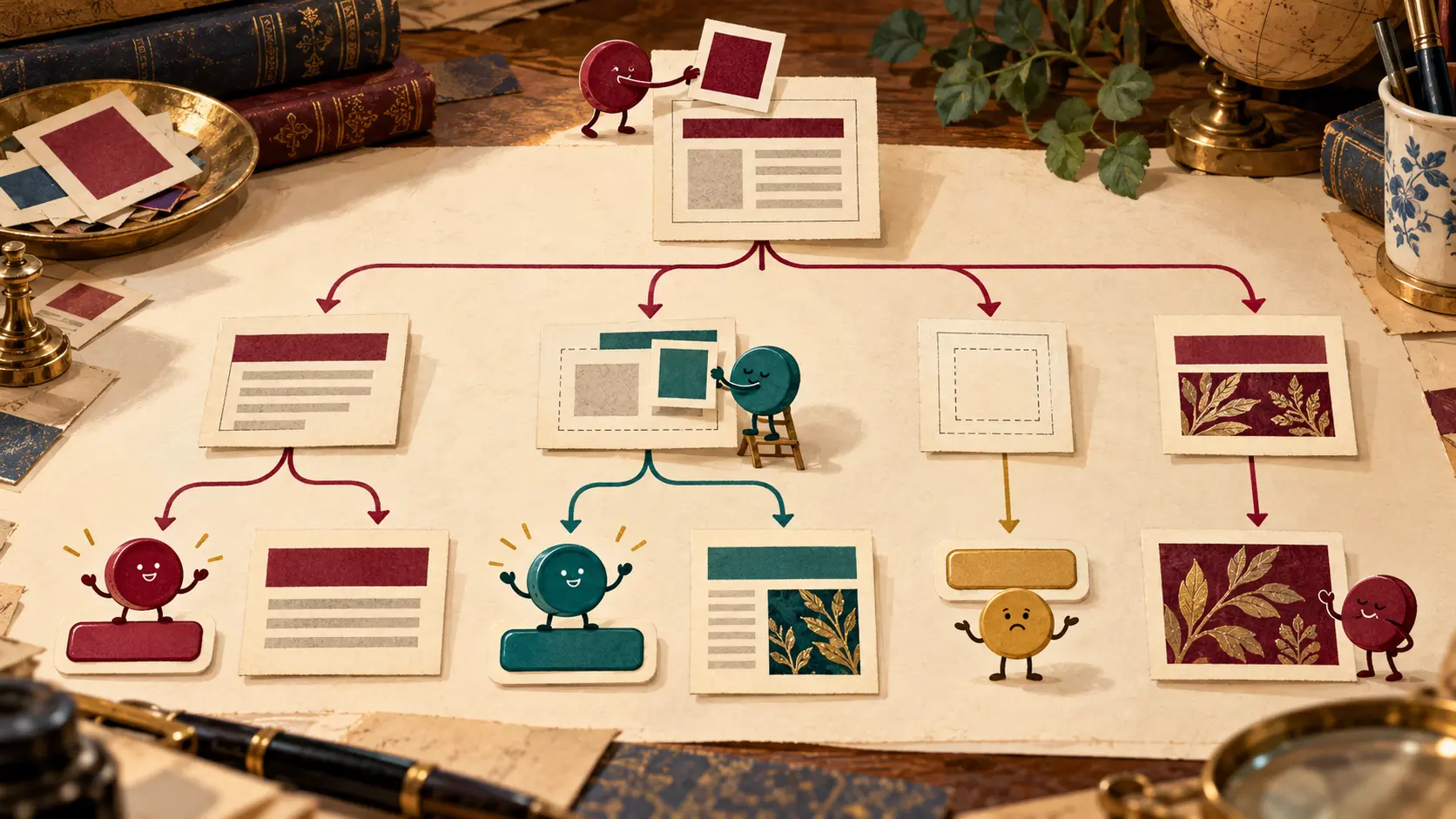
The draft offered a finer conversation. A media query combined a media type with expressions about features of the target environment. Width and height could matter. So could color and resolution. An author could ask for a rule to apply when a viewport reached a minimum width, or when a printed page met a condition of its own. The browser knew the environment; the stylesheet supplied the test. One document could be presented in several ways without asking the newsroom to write the same paragraph three times.
This is the moment to keep the wardrobe metaphor honest. A query does not sew a second article. It decides whether a set of style rules applies. A narrow view may stack columns, simplify the navigation and give a headline more usable space. A print view may remove decorative furniture and arrange the remaining material for paper. The wording of the article remains the wording of the article. Its layout gets changed in the dressing room.
The Candidate Recommendation of 8 July 2002 carried that model further and set out a specification suitable for implementation work. “Candidate” matters here: it records a stage in the standard's history, not a declaration that every browser on earth had already learned the trick. The document still described the same central bargain: more precise labels for presentation, with the content left intact.
By the W3C Recommendation of 19 June 2012, the vocabulary had a finished reference point. A query could name a media type and add zero or more feature expressions. The specification showed conditions using min-width and max-width, along with height and color features. It also covered printed page width. An editor could write a breakpoint for a column that had genuinely run out of room, instead of naming the fashionable device of the month and hoping its dimensions would stay fashionable.
The width in such a query has a detail that has saved many arguments: px means CSS pixels. It is not a promise that a physical screen has exactly that many little squares across it. A dense display and a coarse display may have different physical pixel counts while the CSS layout sees a comparable viewport. The rule should answer a layout question: is there enough space for this arrangement? A product nickname is a poor substitute for measuring the page's actual squeeze.
The Recommendation also specified logical tools such as only and not, and rules for unknown features. Those details matter when a stylesheet has to behave sensibly outside the author's favorite demonstration window. It said user agents were expected to re-evaluate media queries and re-layout a page after relevant environmental changes, while stopping short of making that response mandatory. The editor should inspect actual behavior rather than turn a specification expectation into a claim about every implementation.
There is a small power shift inside this history. The publisher chooses the conditions and the designs on either side of them. The browser evaluates the conditions in the reader's environment. The reader can then make the window narrow enough to expose a bad editorial choice. Media Queries did not decide that a three-column story would fit at every width; they made the decision testable and gave CSS a way to act on the answer.
The editor returned to the wide page, narrowed it, and watched the columns take their seats one below another. Then the printer got a version with less furniture. The article never had to change its story. It simply stopped trying to wear a three-column suit to every occasion.
Member Briefing
Deeper Profile Context
Sign in with the right membership level to unlock the full briefing and source notes.
Only for Strategic Circle
Strategic Circle
Open to all readers. Unlock profile briefings after joining and signing in.
Join Strategic CircleOnly for Leadership Alliance
Leadership Alliance
For qualified IP-asset owners and management; sign in to unlock alliance briefings.
Join Leadership Alliance