
Summary
- A focused button can be reached by mouse or keyboard. The 2018 W3C Selectors Level 4 drafts used
:focus-visibleto expose the browser's decision about when that focus should have an obvious visual marker. - The 2022 drafts clarified the division:
:focustracks focus itself;:focus-visiblelets a site style the indicator at moments the browser judges it useful, including keyboard movement and a reader's preference to keep it visible.
The website has a handsome button. Its designer clicks it, sees a browser outline, and decides the outline is spoiling the furniture. One CSS rule later, the room looks tidier. Then a reader presses Tab. The button receives focus, but the reader sees no address for the next key press. A small aesthetic victory has left somebody playing hide-and-seek with the page. The focus ring has been sacked for looking like a focus ring.
The W3C Selectors Level 4 draft of 2 February 2018 put a name to the difference. :focus describes the element holding input focus. :focus-visible applies when that element is focused and the user agent's heuristics say the focus should be evident. The draft offered two everyday clues: a text field normally needs a visible marker because typing will change its contents; a button reached by keyboard may need one because the reader cannot infer where Tab has landed from a pointer's location. A button just clicked with a mouse presents a different scene. Same button, different route into it.
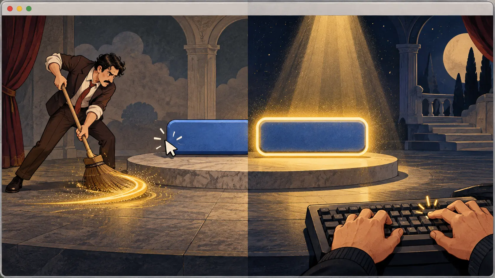
That was a better question than “Should buttons have outlines?” The browser has seen how the reader moved through the page. The publisher can decide what a strong, legible mark looks like. If the publisher removes every outline by using :focus as a broom, the browser's information never reaches the reader. If the publisher styles :focus-visible, the mark can be bold when it earns its place. The focus ring can come back wearing something better than its issued uniform.
The 21 November 2018 draft made that invitation quite literal. Its example gives every :focus-visible element a thick yellow outline and adds a yellow background to focused links. This was not a plea to tolerate the default decoration; it was permission to design an unmistakable one. The example turns a CSS pseudo-class into a practical bargain: the browser decides when to raise the flag, and the site chooses a flag that can be seen from the back of the room.
The draft then walked through how the decision might work. A reader who asks the browser or operating system to always show focus has spoken plainly. A text input is another obvious case: keystrokes will enter that field. Keyboard navigation and other non-pointing input point toward a visible marker; a pointer click on a button can make the destination evident through the click itself. These were suggested heuristics, allowing browsers to use context and user settings. The selector did not force every browser into one choreography. It gave site styles access to the outcome of that choreography.
The most interesting case begins when nobody clicks or tabs directly to the next control. Imagine the keyboard reader opens a dialog and a script moves focus to its first action. The November draft says a visible indicator should follow a previously visible one across such scripted movement. A vanished ring at the doorway would make the next control look like an ambush. The draft also describes the reverse continuity after a pointer-led move. The rule follows the reader's path rather than treating each focused element as an isolated island.
By the 7 May 2022 Working Draft, the definition was expressed with a crisp separation. :focus still matches the currently focused element. :focus-visible matches when the browser chooses to indicate that focus. The draft explicitly says authors can change the indicator's appearance without changing when it appears. It also suggests that user agents use :focus-visible for their default focus styling, so a custom focus style and the browser's own style do not have to wrestle over the same button. This is why the story is about more than a shiny border: it is about one layer making the timing decision and another shaping the visible result.
The 11 November 2022 draft retained that focus-indicated model. Its change history records the clarification made after the 2018 text; it did not need to invent a second selector to solve a problem the first one already named. The W3C publication history puts the steps on the calendar. Across them, the useful constant is a reader with somewhere to go next. On a page full of buttons, links and fields, the bright mark is less decoration than a little street sign.
So the designer gets a quieter click, the keyboard reader gets a visible destination, and the browser keeps the awkward but valuable memory of how each person arrived. The ring was fired because it was noticeable. That turned out to be its qualification.
Member Briefing
Deeper Profile Context
Sign in with the right membership level to unlock the full briefing and source notes.
Only for Strategic Circle
Strategic Circle
Open to all readers. Unlock profile briefings after joining and signing in.
Join Strategic CircleOnly for Leadership Alliance
Leadership Alliance
For qualified IP-asset owners and management; sign in to unlock alliance briefings.
Join Leadership Alliance