
Summary
- The W3C's first public Flexible Box Layout draft of 23 July 2009 described a box whose children could grow into spare space or shrink when room ran short, using early properties such as
box-flex. - The 18 September 2012 Candidate Recommendation used
display: flexand explicit grow, shrink and basis factors. The 19 November 2018 Candidate Recommendation also warned that changing visual order does not move source, speech or keyboard order with it.
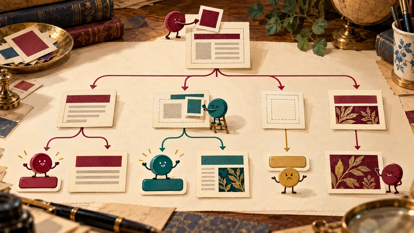
The toolbar had three children and a parent whose apartment changed size every time the window moved. One button wanted room to breathe. Another had a long label and an alarming sense of entitlement. The third was content with its own width until the wall came in. For years, building a responsive row meant bargaining with widths, floats and whatever space remained. Flexbox made the bargaining rules part of the layout model. The parent could say which direction the row ran, which children could grow, which would shrink and where any leftover room went. Family dinner got more mathematical.
The W3C's first public Flexible Box Layout Working Draft of 23 July 2009 started with interface design rather than the geometry of an entire page. Children of a box sat horizontally or vertically. Available space could be assigned to flexible children; short supply could make them contract. The draft drew on the box model used by XUL interfaces. Its CSS vocabulary looked different from the one familiar today: display: box, box-orient, box-flex and box-lines appeared in that early document. The names belong to the historical text, not a promise that old examples can be pasted into a modern stylesheet.
The 2009 draft's box-flex value expressed relative flexibility. A child with a factor of two could take a larger share than one with a factor of one. But the allocation was not a childish free-for-all. A maximum size could stop a child from growing further and pass the remaining space to a sibling. Minimums and intrinsic sizes also mattered. The parent owned the room; the children made claims within limits. That made a changing toolbar less like a row of fixed furniture and more like a table whose leaves could slide.
The W3C Candidate Recommendation of 18 September 2012 presented a reorganized model. A container could use display: flex or inline-flex. Its items followed a main axis, with a cross axis for the other direction. The flex shorthand brought together a grow factor, a shrink factor and a basis: how much room the item starts with, how it shares surplus and how it yields under pressure. An editor could make a search field take spare horizontal room while a menu button kept its footing. Narrow the window, and the rules addressed the shortage instead of leaving a fixed-width row to burst through its frame.
The word “share” is doing real work. Positive free space is divided according to grow factors; negative space is handled by shrink factors and the item sizes involved. A child does not simply win because its label is longer or because it was written first. Nor does a factor of two mean every final width is twice another final width: initial bases and constraints are part of the calculation. The useful question is which item absorbs the change when the container changes. Flexbox gave the author a way to answer that in CSS, where the browser could recalculate it as the window moved.
Space also has a direction. A row can run left to right, right to left or vertically; items can wrap onto more than one line when the container allows it. Alignment rules place them along and across the axes. Nesting a horizontal box inside a vertical one lets an interface build more complex compositions. Yet each flex container is negotiating along its own main axis. That local agreement is the distinctive mechanism in this story, separate from a grid that assigns rows and columns to a broader two-dimensional plan.
Then the family discovered they could rearrange the seating chart. The 2012 Candidate Recommendation described order, which changes the visual arrangement of flex items. The specification was careful about the side effect: speech and default sequential navigation still follow source order. A button shown first can remain later in the keyboard's route. That is a concrete editorial risk, not an abstract argument over markup purity. A sighted mouse user and a keyboard user may meet the same controls in different sequences because someone changed the picture but left the underlying document in place.
The W3C Candidate Recommendation of 19 November 2018 kept developing the flexible layout model and stated the ordering warning plainly. order and reverse direction values belong to visual arrangement, not to fixing a mistaken source sequence. The text also makes the spare-room negotiation more precise. Grow values below one can leave some positive space unclaimed, so “flexible” does not automatically mean “fill every pixel.” The outcome depends on the actual factors, bases and constraints the author chose. An empty strip at the end of a row may be the rule working as written.
That is what makes Flexbox both useful and easy to misunderstand. A designer sees the three toolbar children redistribute themselves and is tempted to think the browser has invented sensible priorities. It has obeyed the ones supplied: direction, basis, growth, shrinkage, wrap and alignment. If a label becomes longer in another language, the negotiation changes. If a button has a minimum size, it may refuse to yield. If a visual order value moves a control, a keyboard path may still visit its original place. The layout is responsive because its rules respond; it is not a substitute for deciding which control matters.
Flexbox made a small but consequential bargain between parent and children. The parent supplies a line and a budget of room. The children grow or yield according to declared factors and constraints. The browser settles the arithmetic whenever the available space changes. The author still has to put the children in a meaningful document order and choose values that serve the reader. The toolbar may argue over the spare room, but the person using it should not have to negotiate with two different maps of the same buttons.
Member Briefing
Deeper Profile Context
Sign in with the right membership level to unlock the full briefing and source notes.
Only for Strategic Circle
Strategic Circle
Open to all readers. Unlock profile briefings after joining and signing in.
Join Strategic CircleOnly for Leadership Alliance
Leadership Alliance
For qualified IP-asset owners and management; sign in to unlock alliance briefings.
Join Leadership Alliance