Will Slack “stop” being Slack? A new simpler layout is set to organize the feature-overload that has been slowing down employees.
Slack is taking a decisive step to tackle the increasing clutter within its interface that arises as users become more immersed in it. The company’s new redesign aims to empower users to manage their messages efficiently and channels within the platform.
Slack Fixes Bloat Which Slows Employees Down
The complexity of Slack’s offerings has been a long-standing challenge. The firm, now owned by Salesforce, has combined team chat, alerts, file storage, knowledge bases, and more under its “digital HQ” framework.
Yet, the accumulation of features over time led to clutter and obscurity, particularly in the critical task of team communication. This issue becomes pronounced when users are involved in numerous workspaces, channels, and group chats.
In response, Slack is introducing its most extensive redesign to date, both altering the app’s appearance and its layout. The primary target audience for this overhaul is the heavy Slack users. Currently, users are compelled to toggle between multiple workspaces to track various activities, mentions, threads, etc. The redesigned interface is tailored to simplify this experience.
What Changes to Expect
Upon launching Slack, users will be greeted with a new Home section, that still resembles the existing interface. However, the transformative shifts become evident from here on.
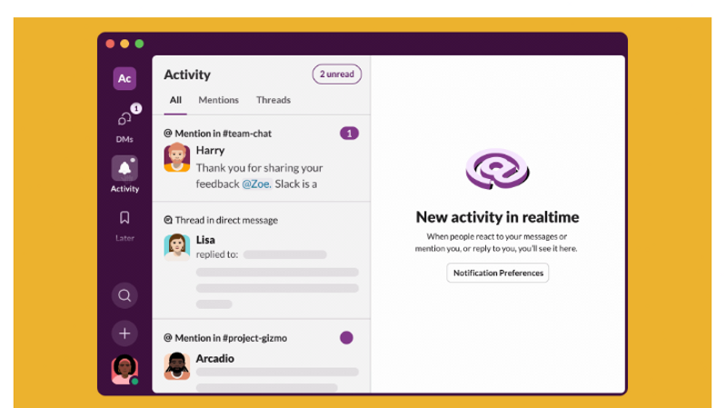
A notable addition is the new left sidebar, offering alternative views of users’ Slack content. The sidebar now includes a dedicated DMs section, resembling conventional messaging and email apps.
Below it lies the Activity window, a consolidated inbox displaying messages, mentions, and reactions across all workspaces. This feature intends to streamline users’ engagement with their messages and notifications as they begin their workday.
Decluttering Information
The core objective of this redesign is to enhance contextual understanding and focus for users. The design encapsulates distinct modes of work, such as catching up, responding to inbound communication, triaging activity, and addressing follow-ups. This reorganisation also supports the needs of users dealing with multiple information streams, enabling them to open multiple views simultaneously.
All these enhancements align with a common goal: managing the diverse stream of information flowing through Slack’s channels. The platform has augmented its workflow efficiency by introducing a dedicated “Later” menu in the sidebar.
This feature empowers users to save items for future reference or action, a function that is now more accessible to a broader audience.
The redesign also brings forth the “Huddles” video chat feature, strategically positioned in the top-right corner of chat windows. Additionally, the creation of new canvases or calls can now be initiated via the “Create” button in the left sidebar.
Slack’s transformation is not an entire rework but rather a reconsideration of its structure. This new arrangement introduces a third layer of organization between the list of users’ content and their active engagement, making pertinent information more accessible.
More Than a Change in Appearance
This redesign as not just an aesthetic change but also as a means to accommodate Slack’s future growth. The platform will continue to integrate new features, leveraging generative AI technology, and enhancing automation capabilities. The objective is to remain a pivotal part of users’ work processes, evolving beyond a mere messaging tool into a comprehensive work operating system.
Slack’s evolution from a messaging app to a holistic work platform aligns with its vision to be the central hub for work-related activities.
The redesign is gradually rolling out to new sign-ups, allowing for refinement through user feedback before reaching existing customers.
(Pic:https://slack.com/blog/productivity/a-redesigned-slack-built-for-focus)

