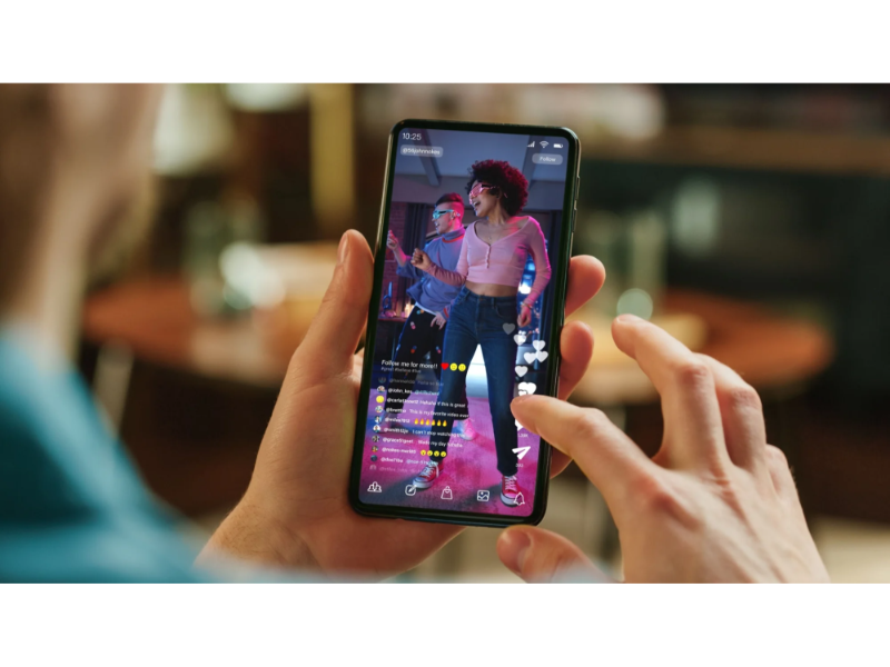
- The dominance of portrait mode on smartphones is rooted in its ergonomic advantages and alignment with traditional text and image content consumption.
- Despite its convenience, portrait mode is limited for gaming and high-quality video viewing, posing challenges for video creators, especially in resolving the ‘landscape vs portrait’ dilemma.
- While portrait format enhances charisma and suits conversational content, landscape videos maintain superiority in professionalism and narrative depth, suggesting a continued need for both formats in the future.
When Steve Jobs unveiled the first-generation iPhone in 2007, it’s unlikely he foresaw one of the most important functions of smartphones in the future would be for watching videos. At that time, 3G and Wifi were not yet widespread, and user-generated content (UGC) video platforms were in their infancy. The concept of “short videos” had not even emerged. Apart from Apple, none of the early smartphone manufacturers seriously considered video viewing functionality during the design process. Therefore, since its inception, smartphones have primarily been designed for portrait mode use.
Also read: Will X ever be as profitable as YouTube for creators?
Also read: TikTok is reshaping how we experience live events for the better
Users prefer holding their phones vertically rather than horizontally

A survey conducted by the UXmatters design community in 2013 showed that the vast majority of users preferred holding their phones vertically rather than horizontally. I believe this proportion has not changed today because the benefits of holding a phone vertically are quite obvious to mainstream users:
• Holding vertically is less strenuous, especially for one-handed operation, making it much more feasible than holding horizontally in most scenarios.
• Vertical orientation is well-suited for traditional text and image content consumption, such as emails, long articles, and information feeds, all of which naturally fit a list-based layout.
• Holding vertically can attract less attention, making it ideal for casual use. Many people have experienced that holding a phone horizontally in settings like offices or meetings can give the impression of gaming, while holding it vertically appears more like attending to business, reducing the likelihood of reprimand from superiors.
There are limitations of vertical orientation
However, the limitations of vertical orientation are also evident: it’s not suitable for gaming or viewing high-quality videos. For game developers, this issue can be addressed by encouraging users to hold their phones horizontally during extended gaming sessions when they are psychologically prepared for immersion. Essentially, this involves temporarily sacrificing convenience for the sake of gaming immersion. In casual games with lower demands for immersion and technical performance, vertical interfaces are still quite common.
Comparatively, video creators face more severe challenges, especially for PUGC creators and developers of ‘industrial entry-level’ short-form content (such as short dramas, micro-films), the ‘landscape vs portrait’ becomes an unavoidable and difficult issue to resolve. This problem has plagued the online video content industry for over a decade, to some extent impeding further penetration of video content. Let’s briefly explain:
Firstly, human eyes are naturally more accustomed to viewing landscape content. The horizontal field of view is much larger than the vertical one, which is why the global film industry has continuously evolved towards ‘widescreen’ over the past century – starting with 1.33:1, then 1.85:1, and now the most popular being 2.35:1. Some professional monitor manufacturers have even introduced ultra-wide resolutions of 32:9 (3.55:1); perhaps soon we’ll see such ultra-wide content in cinemas too.
Secondly, human mobility is constrained by gravity, with much greater expansion capabilities horizontally than vertically. In any drama, the main activity range of characters is within their own height range, so most dramatic conflicts occur within the range of ordinary human height. For most content genres, there’s little to explore vertically.
Lastly, before the advent of smartphones, the entire film and television industry was built around the landscape format. If you were to produce 1.85:1 or 2.35:1 industrial-grade videos, you’d have a standardised, robust workflow from pre-production to post-production; making vertical videos involves much more hassle, essentially trimming on top of the landscape format.
Which type of the video will be more suitable for broadcast larger-scale events?
A. Horizontal video
B. Vertical video
C. Both
The correct answer is at the bottom of the article.
Vertical videos do have a unique advantage but narrowly

Admittedly, vertical videos do have a unique advantage: the focus on the protagonist significantly enhances their charisma. Therefore, vertical format is particularly suitable for conversational, talent-based, and some daily life videos. Most personal live broadcasts are also vertical, as it allows the host to occupy as much space as possible, making their speech more persuasive and their body language more exaggerated and memorable.
However, the ‘advantageous scenarios’ for vertical live broadcasts are very narrow. The more complex, narrative-driven, and professional the video content, the more apparent the disadvantages of vertical compared to landscape. Here are two simple examples:
‘Vertical short dramas’ have been developing for many years, giving rise to some small hits. However, once the investment scale of a vertical drama increases and it enters the industrial and IP era, it often must transition to landscape. Vertical dramas with single episode lengths of over 10 minutes and meeting film and television industry standards are extremely rare.
‘Vertical live broadcasts of large-scale events’ have also become common, with the most typical example being the 2022 WeChat Video’s live broadcast of the Spring Festival Gala. While many people find broadcasting the Spring Festival Gala in portrait mode novel, most complain that the perspective is too narrow and strange. If you were to vertically broadcast larger-scale events like the opening ceremony of the Olympics, it’s even more unimaginable, as it would lose the majority of its content appeal.
It is not a simple question
You might think solving the ‘landscape vs portrait’ issue is simple: let industrial-grade long videos (e.g., TV dramas) choose landscape, while PUGC-level short videos choose portrait, keeping things separate. Initially, most platforms and content creators thought so too. However, with the continuous evolution of internet video content, some more challenging problems have emerged:
From the platform perspective, nearly all video platforms now pursue ‘full coverage’ of various content—TikTok develops landscape, Bilibili develops portrait, YouTube simultaneously enters professional film and short video fields. Within the same app, how can seamless switching between landscape and portrait content be achieved? Especially under the current most popular single-page feed interface, where users switch between portrait and landscape content, the experience significantly deteriorates. In this scenario, landscape content often becomes the sacrificial lamb.
From the content perspective, the development of ‘long videos’ and ‘short videos’ is becoming inseparable, with the emergence of the concept of ‘medium videos’ in recent years. So, the question arises: should ‘medium videos’ be landscape or portrait? For content derived from long videos such as trailers, montages, fan edits, etc., should they be landscape or portrait? Regardless of how it’s done, there will inevitably be some users who are dissatisfied.
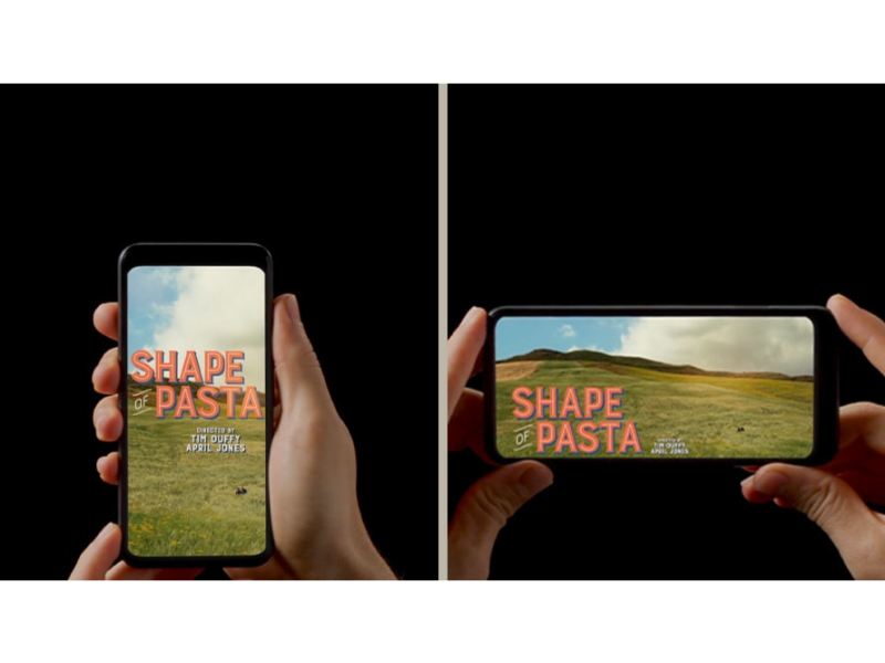
You may notice that some ‘medium video’ content providers have adopted a compromise: adding borders above and below landscape videos to better suit portrait viewers’ habits. For instance, a video has a 1:85:1 original material with added top and bottom bars to make it 1:33:1, barely covering both landscape and portrait users (though not ideal).
Some content providers go even further, adding larger borders to convert 1:85:1 (or even 2:35:1) landscape material into 3:4 or even 9:16 portrait videos. This method is even less ideal because excessive borders don’t provide enough information and hinder users from switching to landscape mode. Sadly, many corporate promotional videos, movie trailers, and short documentaries are disseminated on short video platforms in this ‘bordered’ format. The sacrifices made by this dissemination method are too significant.
The opposition between ‘landscape vs portrait’ also hinders PUGC creators from flowing towards industrialisation and IP development. As mentioned earlier, the human film industry is built upon a landscape system, and most professional-level content is landscape. However, due to smartphone users’ preference for watching short content in portrait mode, most PUGC creators must start with portrait content, gaining enough traffic with a portrait mindset and production habits before considering transitioning to industrialisation—this is when ‘whether to switch to landscape and how to switch’ becomes their nightmare again.
The development space for landscape videos will gradually expand
In summary, landscape videos have an absolute advantage in professionalism and expressive power, while portrait videos mainly excel in user convenience (and personal appeal). We have yet to find a unified framework to address the question of ‘what kind of video should be landscape, what kind should be portrait,’ let alone solve the problem of ‘how to effectively disseminate landscape content on portrait video platforms.’ To truly address these issues, we may need to rely on mature VR glasses or even brain-computer interfaces. Only then can video content formats be liberated from the hardware platform of smartphones.
Nevertheless, based on the experience and common sense of the past years, I still believe that the development space for landscape videos will gradually expand, narrowing the gap with portrait videos. If ‘medium videos’ indeed become an independent video format, they will still primarily be in landscape. Currently, the most popular educational videos are also best presented in landscape. Furthermore, I’ve always believed that ‘portrait dramas’ are merely a gimmick with market space being very limited.
No one can deny that portrait videos better suit the usage habits of smartphone users, especially for immersive ‘video browsing.’ However, if someone overly advocates for the application scenarios of portrait videos, even drawing the conclusion that portrait will continuously replace landscape, they are gravely mistaken. Serious content creators (especially industrial-level creators) should not make such shortsighted mistakes.
The correct answer is A, horizontal video.

